This post is part of the Designing Horror series.
Game: The White Chamber by Studio Trophis (which doesn’t properly exist anymore.)
The White Chamber is about a woman who wakes up in a coffin on a spaceship. The station is abandoned (seemingly) except for her, and as the narrative unfolds the player is given glimpses into the back story of the game. Creepy things are happening in space. Now it is time to adventure game your way around the station to…get on an escape pod? Leave the station? The game ends there, so obviously it is what you’re looking for, but there isn’t a lot of information to get you there.
1. How Does It Work?
The game is a point and click adventure mystery game. There are two predominate ways that I found it “working” on me: the first was through the sound design; the second was through the slow camera panning.
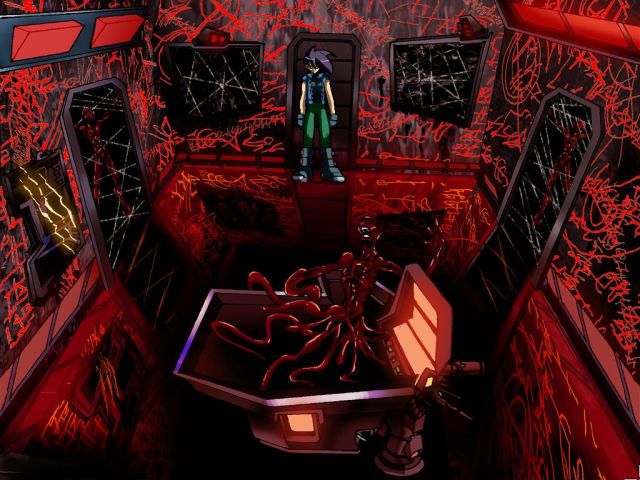
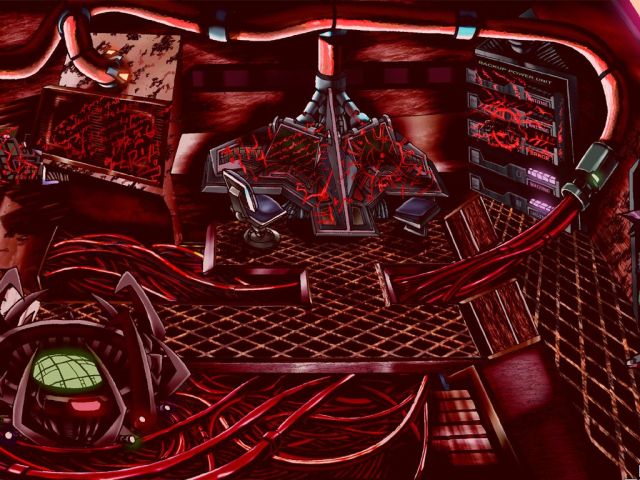
Of course, the visual aesthetic is also there. The station will occasionally flip into a strange, alien place covered in meat/blood/monsters/whatever. The Silent Hill series shows through; The White Chamber gets zero points for originality there. So I don’t find that scary, and I don’t find it horrify–by that, I mean that it isn’t arresting. It doesn’t capture me and hold me.
So, sound design. It isn’t amazing, nor is it different from other horror games, but it doesn’t come off as trite in a way that the shifting visuals do. There is one sequence in particular that has stuck with me–the main character walks down a hallway toward the camera. When she reaches the end of the hallway, she starts again, walking down the same screen. The only difference, short of some small visual changes, is that the audio turns into a constant murmur. Every time the player completes the screen, it gets louder, eventually drowning every other sound out. In that moment, there is nothing to do other than walking away, trying to escape, but you are forced to complete the same task over and over again. A literal entrapment in gamespace purgatory. Sublime.
The camera panning is the second effective design strategy of the game. Like previous games in the Designing Horror series (Yeti Hunter in particular), The White Chamber establishes a sense of unease through a limitation of the visual field. Part of this is the changing of areas outside of the field of view of the player e.g. when the player moves from one room to another, suddenly everything is covered in blood. There is nothing dependable or reliable outside of that which is immediately invisible and experienced (this is something that exists in adventure games as a genre, too.)
The White Chamber takes the extra step here by delaying the camera pan until the player character reaches the side of the screen–the player is not kept in the immediate center of the screen at all times. This achieves two effects simultaneously. First, the world outside of the frame seems to make its way into the screen–I was always anticipating, waiting, scared to know if something was going to suddenly appear onscreen, dreadfully close to my walking self. Second, it establishes that the player is not at the center of the game world. The space station, and its terrible secrets and scary things, are as ontologically sound and stable as the player character. Why would the camera follow her? She is just another piece of a large, strange puzzle with a number of actors. And maybe that is horrifying in and of itself.
2. Why Is It Horror?
It is horror because it is attempting to implant a sense of dread and mystery into the player. It is horror because it wants to hold you enrapt in the puzzle itself, in the strangeness of the severed body parts, the insatiable mouth, the shifting landscape. It wants to keep the player inside itself.
3. What Did It Do To Me?
It didn’t do a lot. This game was much more intellectually stimulating than it was actually horrifying, though there was a despair-effect from the slow camera pan.


According to TV Tropes, the game has more than one ending. You may not have seen the whole story…